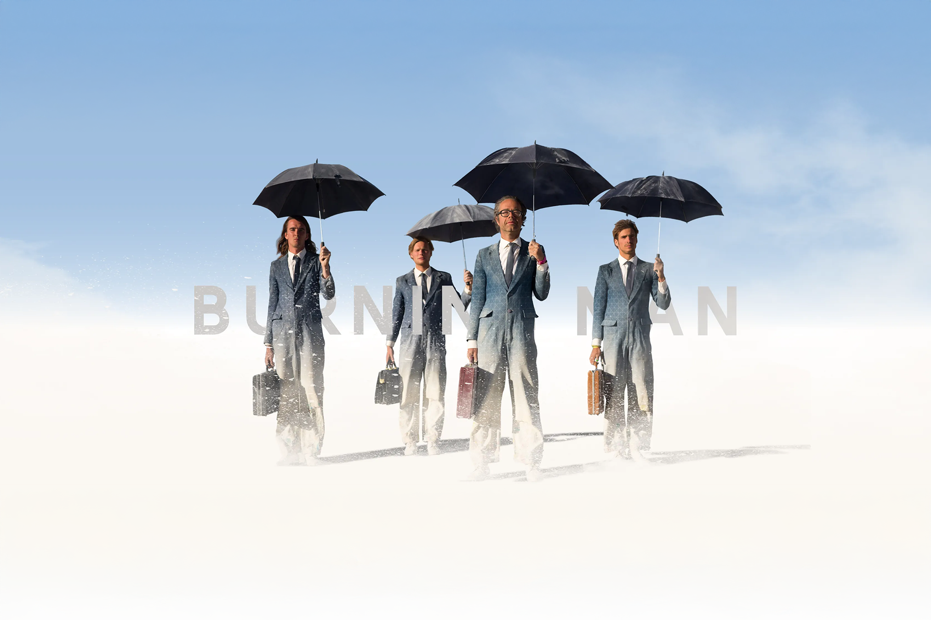
Burning Man
A user experience that mirrors Burning Man's essence: connection before conversion.
This project reimagines the digital experience of Burning Man, one of the world's most unconventional gatherings. Developed during my UX/UI Bootcamp at Ironhack, it started as a simple ticket-purchase redesign challenge, but soon evolved into a deeper exploration of how design can reflect culture and community.
Ironically, my concept was inspired by "The Multiverse", the official theme for Burning Man 2020 — a celebration of connection across parallel realities. When the pandemic hit, the physical edition of the festival was canceled, and the world itself suddenly felt like a fragmented multiverse. This coincidence gave the project a deeper meaning: it wasn't just about usability or aesthetics, but about designing for a sense of belonging in a disconnected world.
Through research, empathy, and visual storytelling, the redesign transformed an outdated interface into a meaningful journey that embodies the festival's core values: community, creativity, and radical self-expression.
Challenge
Redesign the Burning Man website's ticket-purchase flow to improve usability while keeping the spirit of the event alive.
At first, I assumed it was just another music festival — which made me believe the main goal should be driving ticket sales. The research quickly proved me wrong.
Research & Insights
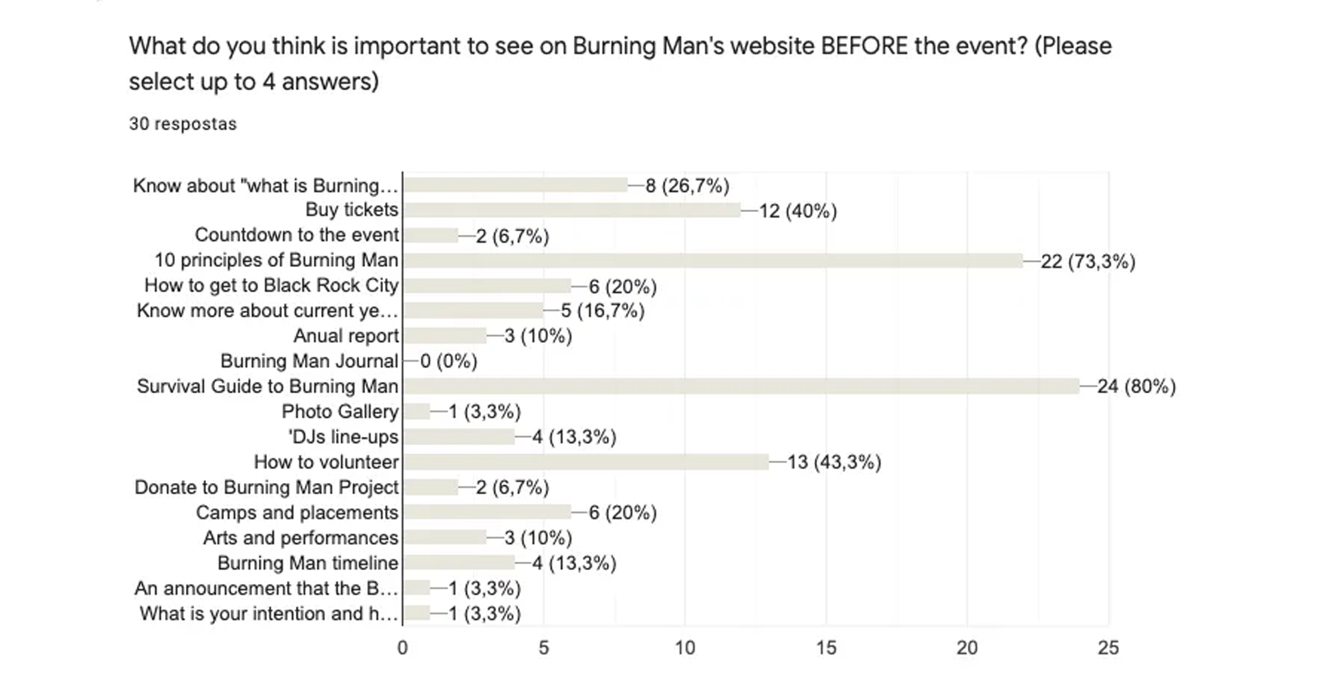
Through interviews, Reddit and Facebook community surveys, and analysis of existing festivals (Coachella, Tomorrowland, etc.), I discovered that Burning Man isn't about concerts or brands — it's a self-organized community built on ten guiding principles.
Attendees care far more about values, collaboration, and survival guidance than about countdowns or flashy CTAs.
This shifted the design question from "How can users buy tickets faster?" to "How can the site communicate meaning and community before commerce?"
Process
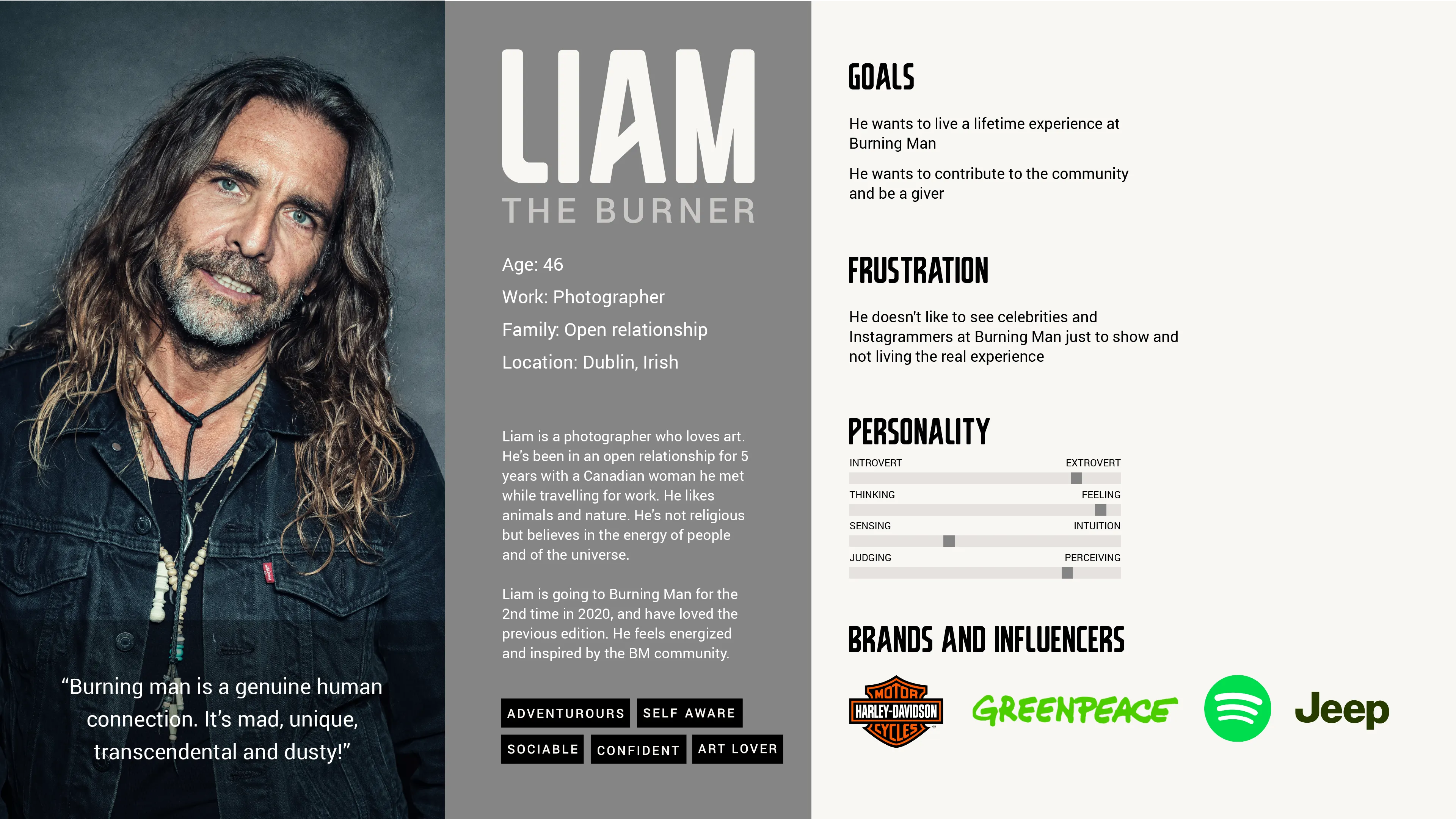
- Survey & interviews: gathered qualitative feedback from real "burners."
- Persona: Liam the Burner — a first-time attendee looking for connection and purpose.
- Information architecture: reorganized the navigation to highlight the event's principles, "Survival Guide," and ticket info in a clear hierarchy.
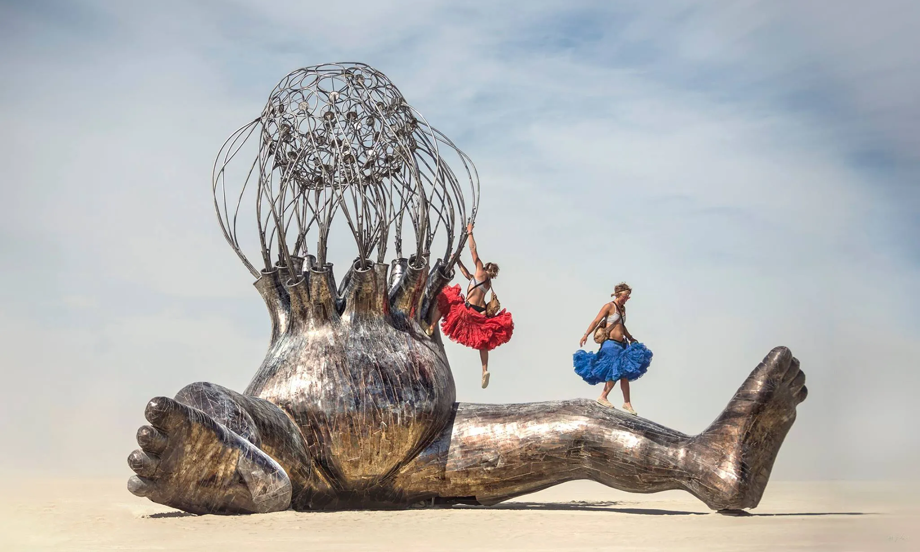
- Visual direction: moodboard inspired by the desert's warm tones by day and neon lights by night, capturing the surreal yet human essence of Black Rock City.
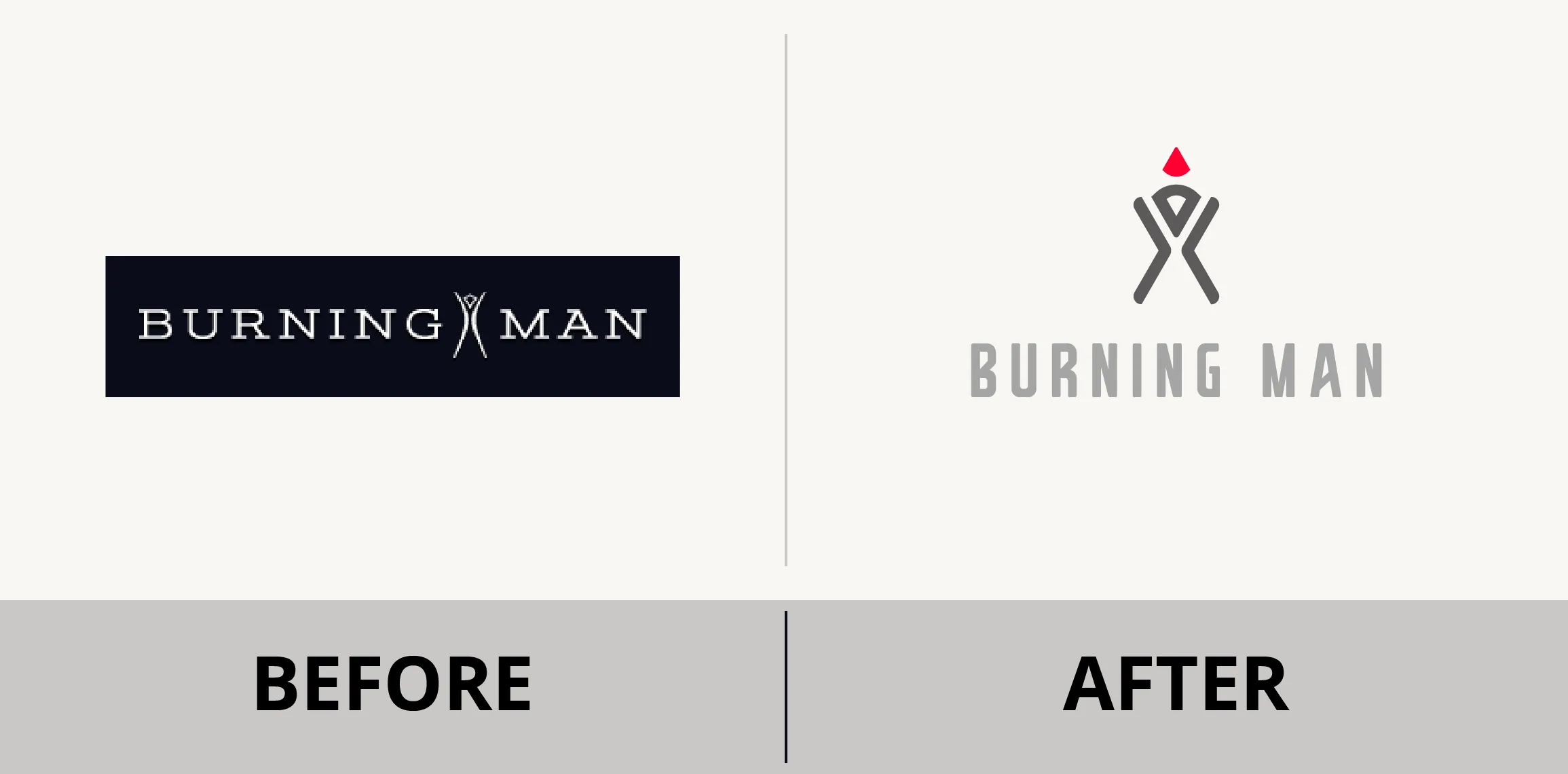
- Rebranding: unified logo concept representing The Man — simplified geometry, consistent typography, and a subtle flame symbolizing perpetual transformation.
.webp)
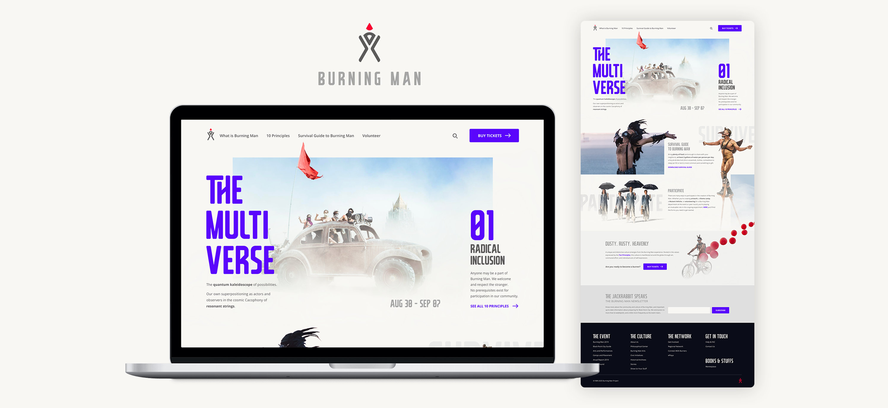
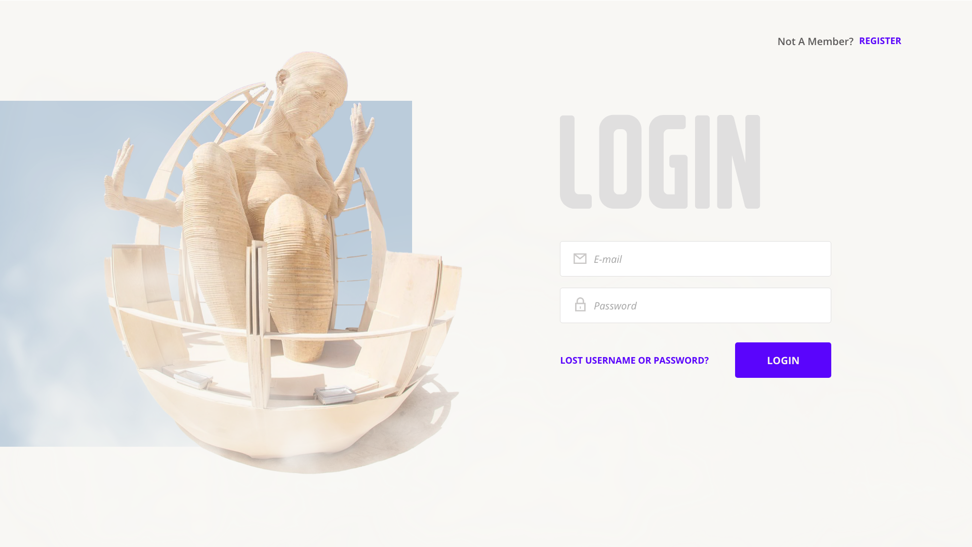
Solution
A responsive interface that tells the story before asking for the sale. The home page introduces the yearly theme, a featured principle, and clear links to practical information. The ticket flow remains visible but secondary, emerging naturally as part of the journey.
This balance between usability and narrative creates a more authentic first contact with the Burning Man ethos.
Outcomes & Learning
What began as a visual redesign became an exercise in empathy and unlearning assumptions. Understanding users reshaped the project from a sales funnel into a storytelling experience.
It strengthened my ability to question first impressions, translate values into interface decisions, and design not only for users but with their mindset in mind.
It remains one of my favorite case studies — the project where I learned to go deep, then come back up with meaning.