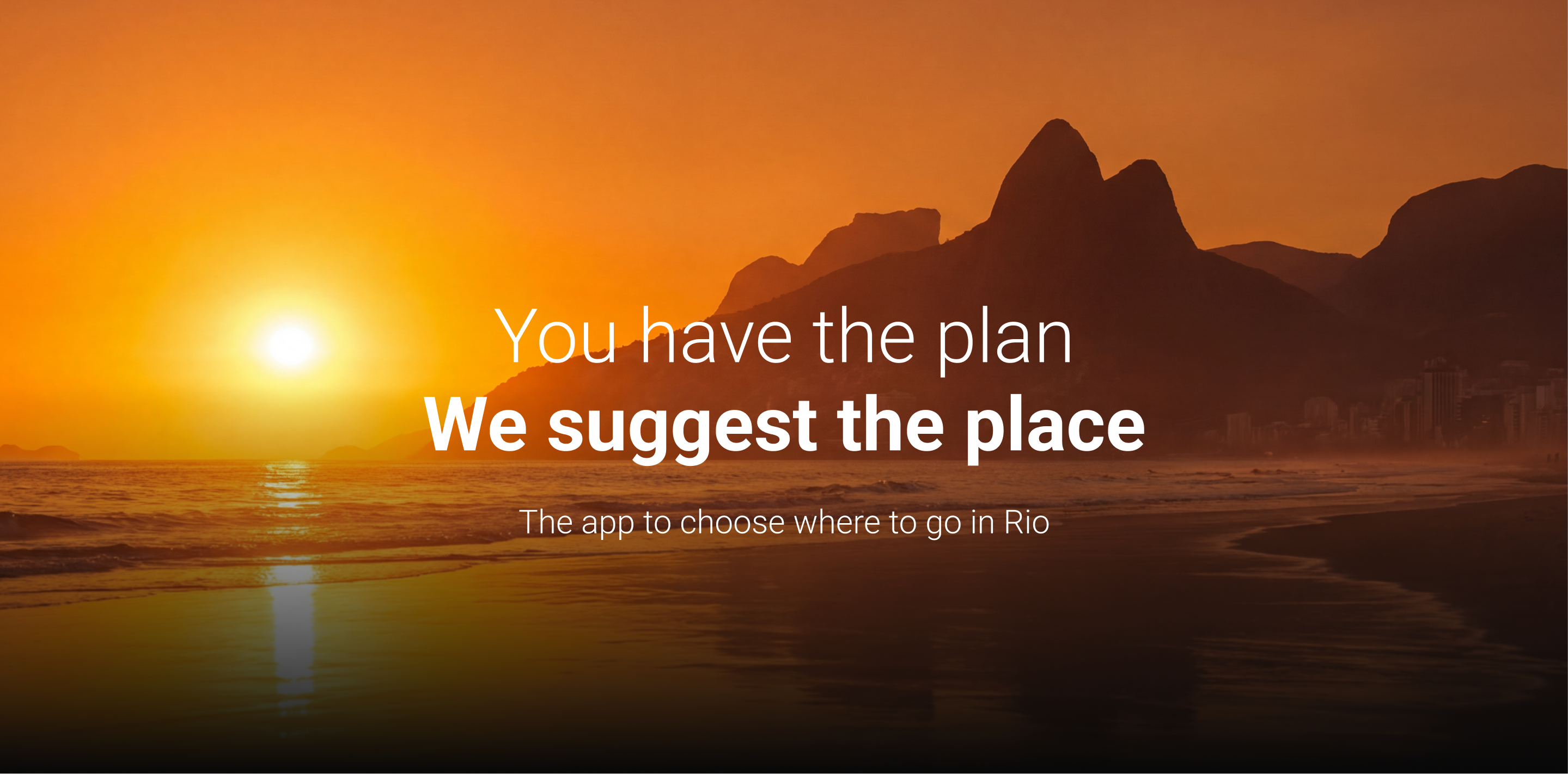
Me Põe Na Boa
Helping people decide where to go, without overthinking it.
MPB is a discovery app focused on helping users find places and experiences quickly, without turning the process into endless scrolling or decision fatigue.
My role was to take an early-stage product and turn it into a cohesive experience, connecting the app, landing page, and social content into a system that actually works together.
Context & Challenge
The initial version of MPB had the right idea, but lacked consistency. Screens existed in isolation, navigation wasn't fully clear, and there was no strong visual system tying everything together — from onboarding to search to place details.
The main challenge wasn't just designing screens, but making the experience feel continuous. Every step needed to connect logically, especially in moments where users are trying to decide fast.
Objective
The goal was to design a product that reduces friction in decision-making. That meant making navigation predictable, structuring information so users don't have to figure things out, and building a visual system that scales across the app, landing page, and social.
Concept & Visual Direction
The visual direction didn't start from an abstract concept, but from a practical need: helping users decide faster without overwhelming them.
Three principles guided the design:
- Strong hierarchy, especially in dense screens like menus and place details
- Color used with purpose, helping differentiate categories, states, and content types
- Clean layouts that stay easy to navigate without feeling cold or impersonal
Typography was structured to guide reading almost automatically, with clear separation between titles, metadata, and supporting information.
The color palette works more as a system than as decoration. Each color helps users understand context, not just aesthetics.
The result isn't just a "nice-looking" interface, but one that supports decision-making, especially in critical moments like comparing options or choosing where to go.
Information Architecture & UX
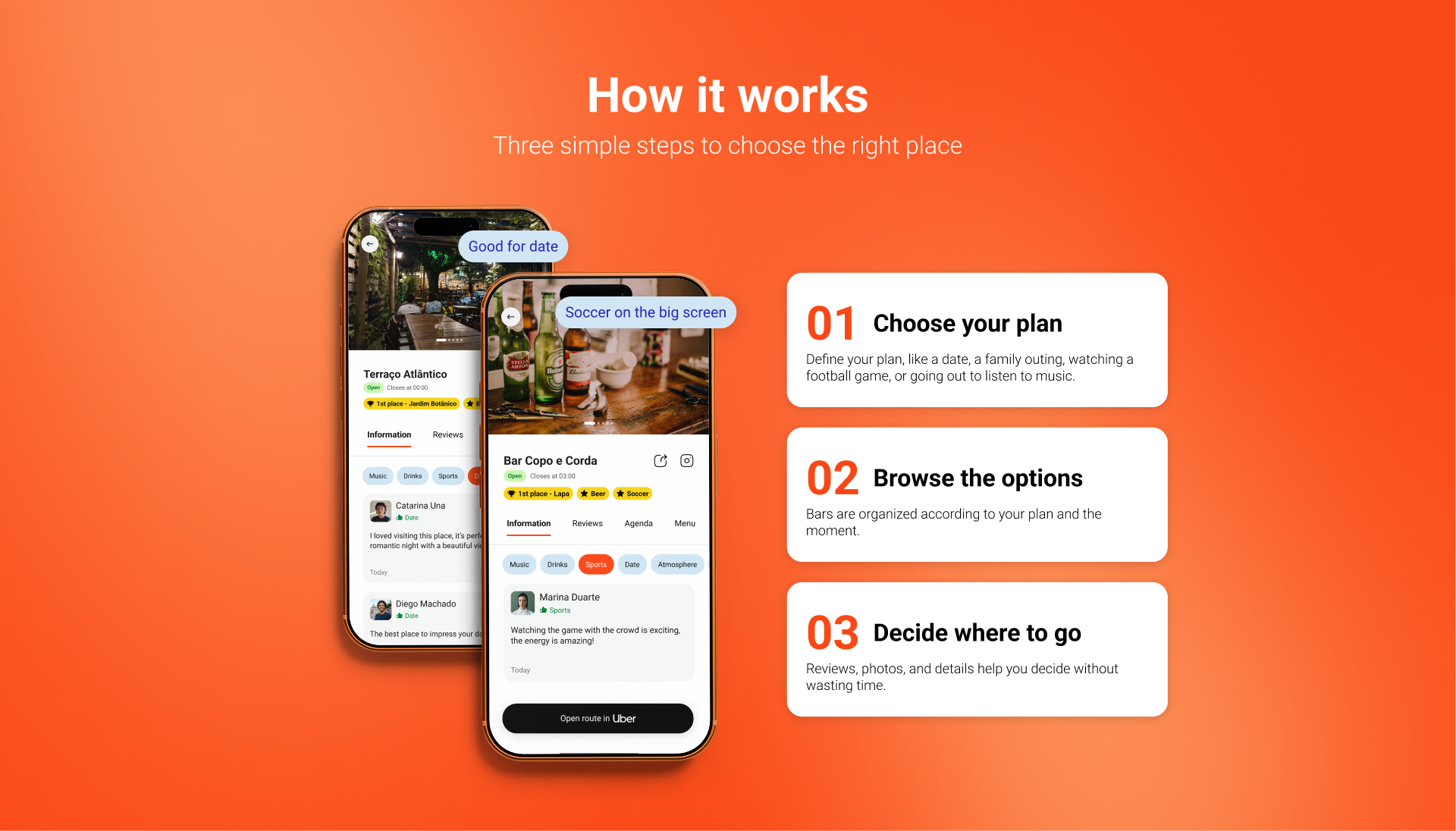
The navigation was designed to be straightforward and familiar, reducing cognitive load.
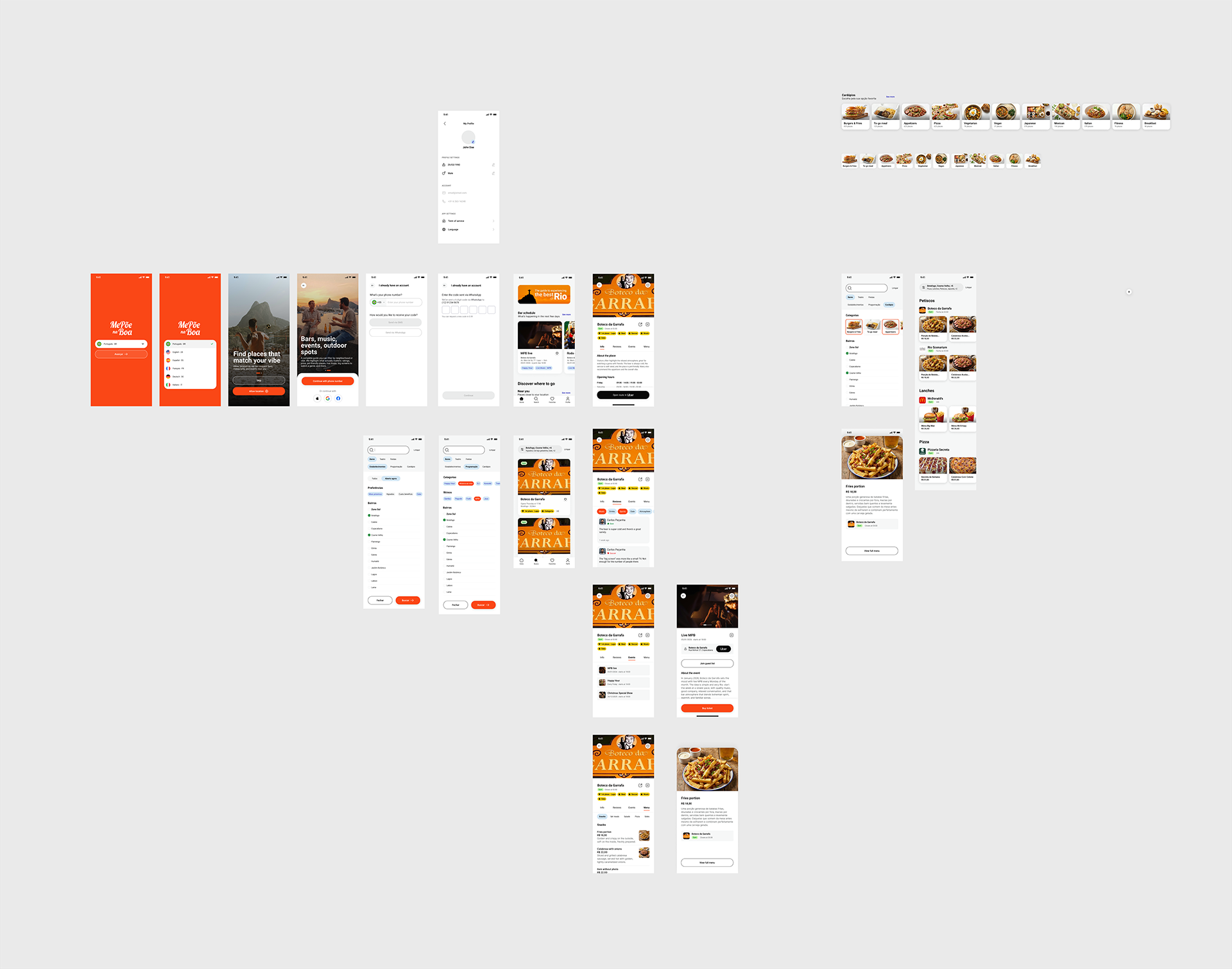
Key flows include:
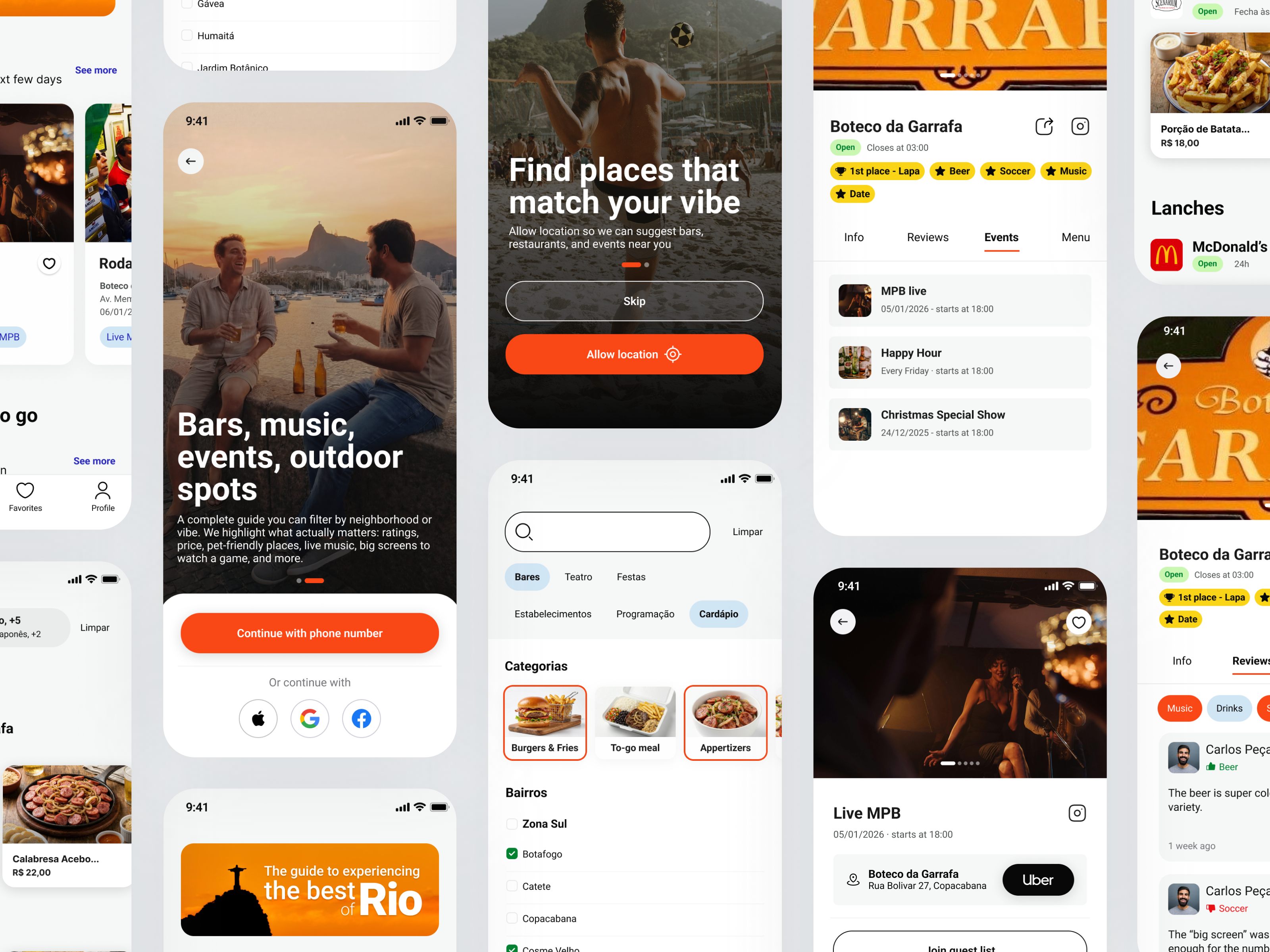
- Onboarding and splash that set expectations quickly
- Login / signup with country code selection
- Home focused on useful, scannable content
- Search with categories and filters, making exploration structured
- Search results → place details, with a clear progression of information
- Menu pages, prioritizing readability and quick scanning
- Reviews, reinforcing trust and social proof
- Profile, consolidating user activity and preferences
Instead of adding features, the focus was on making existing flows clearer and more usable.
Visual System & Scalability
To support growth, the project included a base set of reusable components and patterns.
This extended beyond the app into:
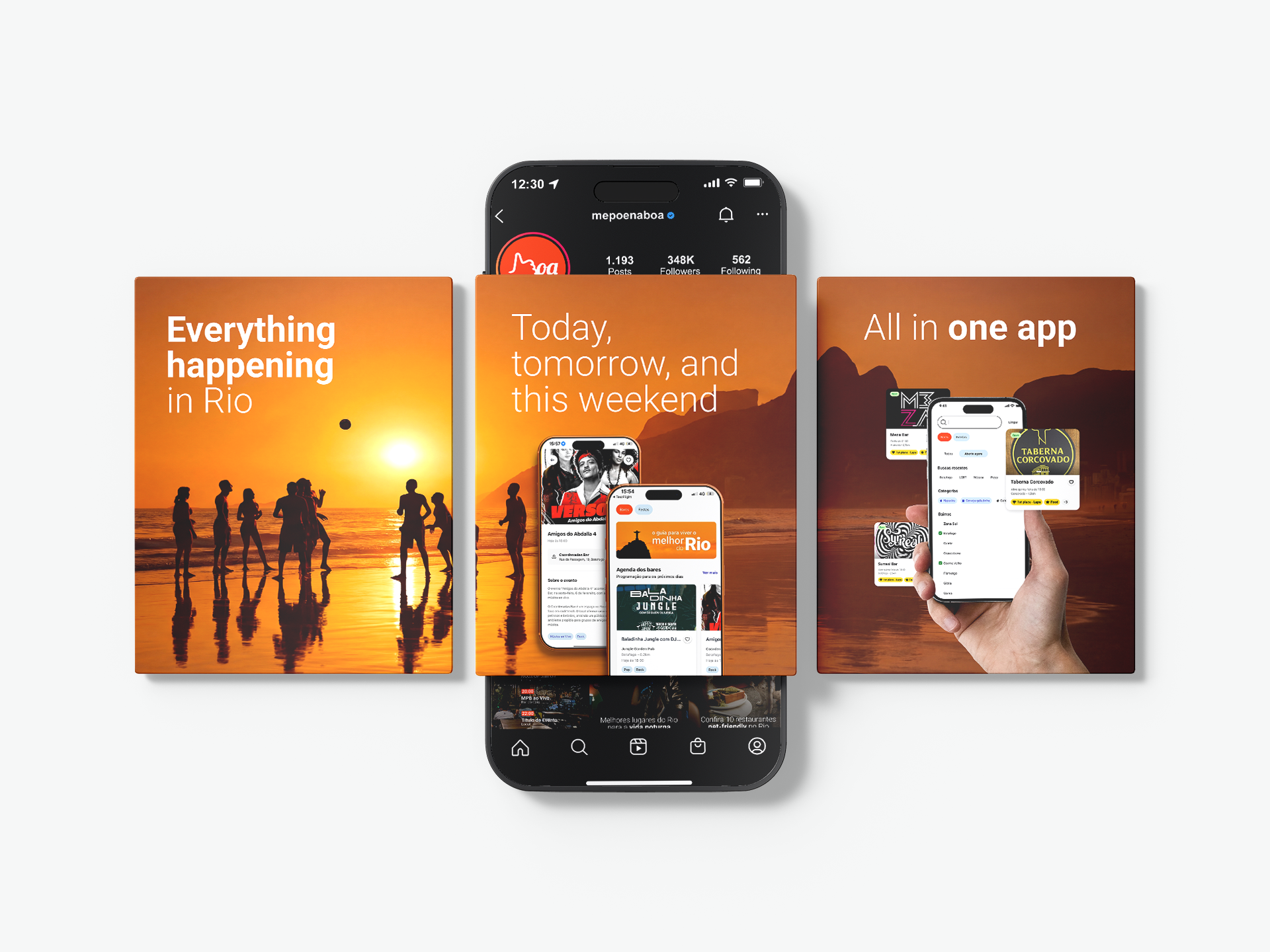
- A landing page aligned with the product experience
- A set of Instagram templates, ensuring consistency in communication
This system allows the product to evolve without losing visual coherence, while also making content production faster.
Outcome
MPB moved from a collection of screens to a structured product.
The experience became easier to understand, easier to navigate, and more aligned across touchpoints.
Impact
Most importantly, the design supports what the product is supposed to do: help people make decisions faster, with less friction.
The unified visual system now enables faster content production and ensures brand consistency as the product scales.